Contextual Settings in Contentful
Where should a visual setting live - on the child or on the parent? For example, who decides whether a button is primary or secondary: the button itself, or the thing that holds the button?
I call these contextual settings. A contextual setting doesn't describe the content. It describes how the content is shown in one particular place.
Let's take an example of a Card Section that can show its cards in either a large size or a medium size.
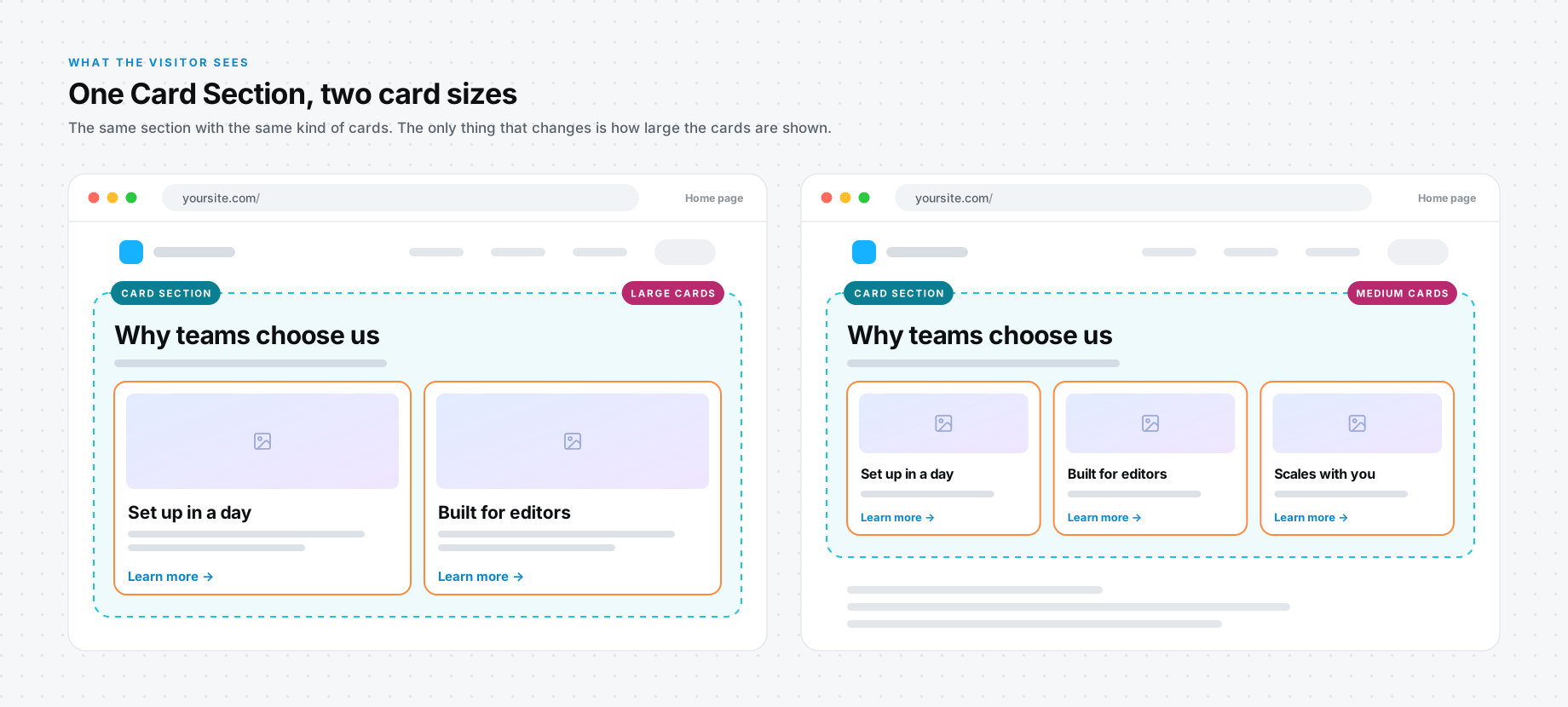
Let's imagine you have a Card Section that wraps the Card Items, which I talked about in the Wrapper Pattern snippet. You now have two options for where you define the size of the cards. It can be a dropdown on the Card Item, where the editor selects the size of that card. Or it can be a dropdown on the Card Section. Let's look at these two options and then compare them.
Option 1: Size on the Card Item
This is the obvious one. The card is the thing that changes size, so the card gets the dropdown.
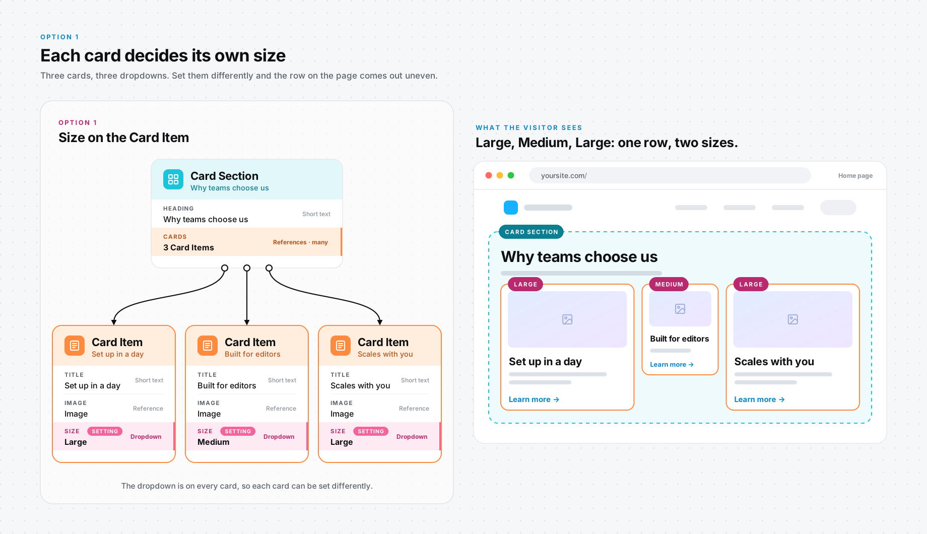
Let's explore that a bit. An editor who builds a section of three cards now has to set the size three times. And nothing stops them from setting two cards to Large and one to Medium. Now you have a row that looks broken, and the application has to decide what to do with it.
There is a second problem, and it's the bigger one. A card can be reused. Say the same Card Item is shown in a section on the Home page and in another one on the Pricing page. With Size on the card, it's the same size in both places. What if you want it large on one page and medium on the other? You have to create the card again, and now the same content lives in two entries.
There is one case for this option. If you really do want mixed sizes in one row - one large card next to two smaller ones - only option 1 gives you that.
Option 2: Size on the Card Section
The other option is one dropdown on the Card Section, and every card in the section follows it.
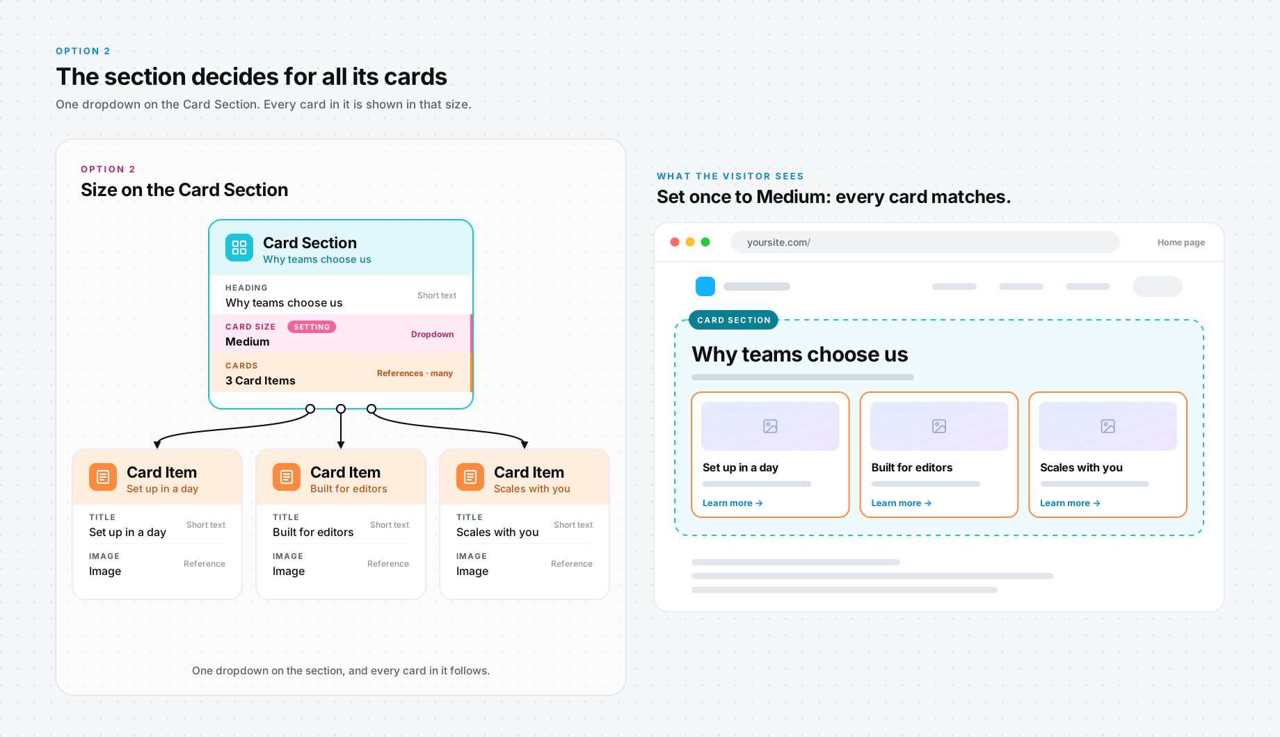
From the editor's perspective, this is simple. They set the size once and that's that. The cards can't drift apart. And the Card Item is left holding only its content, so it can be reused anywhere, and each section decides how to show it.
What does it cost? From an engineering perspective, the card can no longer render on its own. The application has to pass the size down from the section to each card. In my opinion, that's a small price to pay.
Our Recommendation
I go with option 2. The size is not really about the card. It's about where the card is shown.
Here is the question I ask: would this value change if the same entry showed up somewhere else? If the answer is yes, it's a contextual setting and it belongs on the parent. If it's always true about the entry, wherever it shows up, it belongs on the entry itself.
So what about the button from the beginning? In the Links and Buttons snippet, the Style sits on the Button, and I still think that's right. The Button there is the parent. It wraps the Link, and the Link is the part that gets reused. The Link never knows whether it's shown as primary or secondary.